Drag to edit
When selectedEvent is declared, edit mode will be enabled
Example
Example
import { EventItem, PackedEvent, TimelineCalendar } from '@howljs/calendar-kit';
import React, { useState } from 'react';
import {
  SafeAreaView,
  StyleSheet,
  Text,
  TouchableOpacity,
  View,
} from 'react-native';

const exampleEvents: EventItem[] = [
  {
    id: '1',
    title: 'Event 1',
    start: '2022-11-06T09:00:05.313Z',
    end: '2022-11-06T12:00:05.313Z',
    color: '#A3C7D6',
  },
  {
    id: '2',
    title: 'Event 2',
    start: '2022-11-06T11:00:05.313Z',
    end: '2022-11-06T14:00:05.313Z',
    color: '#B1AFFF',
  },
];

const Calendar = () => {
  const [events, setEvents] = useState<EventItem[]>(exampleEvents);
  const [selectedEvent, setSelectedEvent] = useState<PackedEvent>();

  const _onLongPressEvent = (event: PackedEvent) => {
    setSelectedEvent(event);
  };

  const _onPressCancel = () => {
    setSelectedEvent(undefined);
  };

  const _onPressSubmit = () => {
    setEvents((prevEvents) =>
      prevEvents.map((ev) => {
        if (ev.id === selectedEvent?.id) {
          return { ...ev, ...selectedEvent };
        }
        return ev;
      })
    );
    setSelectedEvent(undefined);
  };

  const _renderEditFooter = () => {
    return (
      <View style={styles.footer}>
        <TouchableOpacity style={styles.button} onPress={_onPressCancel}>
          <Text style={styles.btnText}>Cancel</Text>
        </TouchableOpacity>
        <TouchableOpacity style={styles.button} onPress={_onPressSubmit}>
          <Text style={styles.btnText}>Save</Text>
        </TouchableOpacity>
      </View>
    );
  };

  return (
    <SafeAreaView style={styles.container}>
      <TimelineCalendar
        viewMode="week"
        events={events}
        onLongPressEvent={_onLongPressEvent}
        selectedEvent={selectedEvent}
        onEndDragSelectedEvent={setSelectedEvent}
        // Optional
        dragStep={20}
        theme={{
          dragHourContainer: {
            backgroundColor: '#FFF',
            borderColor: '#001253',
          },
          dragHourText: { color: '#001253' },
          editIndicatorColor: '#FFF',
        }}
        // End Optional

        // Custom edit indicator
        EditIndicatorComponent={<View style={{ backgroundColor: 'red', width: '100%', height: 16 }} />}
      />
      {!!selectedEvent && _renderEditFooter()}
    </SafeAreaView>
  );
};

export default Calendar;

const styles = StyleSheet.create({
  container: { flex: 1, backgroundColor: '#FFF' },
  footer: {
    position: 'absolute',
    bottom: 0,
    left: 0,
    right: 0,
    backgroundColor: '#FFF',
    height: 85,
    shadowColor: '#000',
    shadowOffset: {
      width: 0,
      height: -2,
    },
    shadowOpacity: 0.22,
    shadowRadius: 2.22,
    elevation: 3,
    flexDirection: 'row',
    justifyContent: 'center',
  },
  button: {
    height: 45,
    paddingHorizontal: 24,
    backgroundColor: '#1973E7',
    justifyContent: 'center',
    borderRadius: 24,
    marginHorizontal: 8,
    marginVertical: 8,
  },
  btnText: { fontSize: 16, color: '#FFF', fontWeight: 'bold' },
});
Props
selectedEvent
When selectedEvent is declared, edit mode will be enabled
objectonLongPressEvent
Callback function will be called when the event item is long pressed
functiononEndDragSelectedEvent
Callback function will be called when the selected event item is dropped
functiondragStep
Handle the navigation time when navigating to next/previous view while dragging. Default is 10 minutes
numbertheme
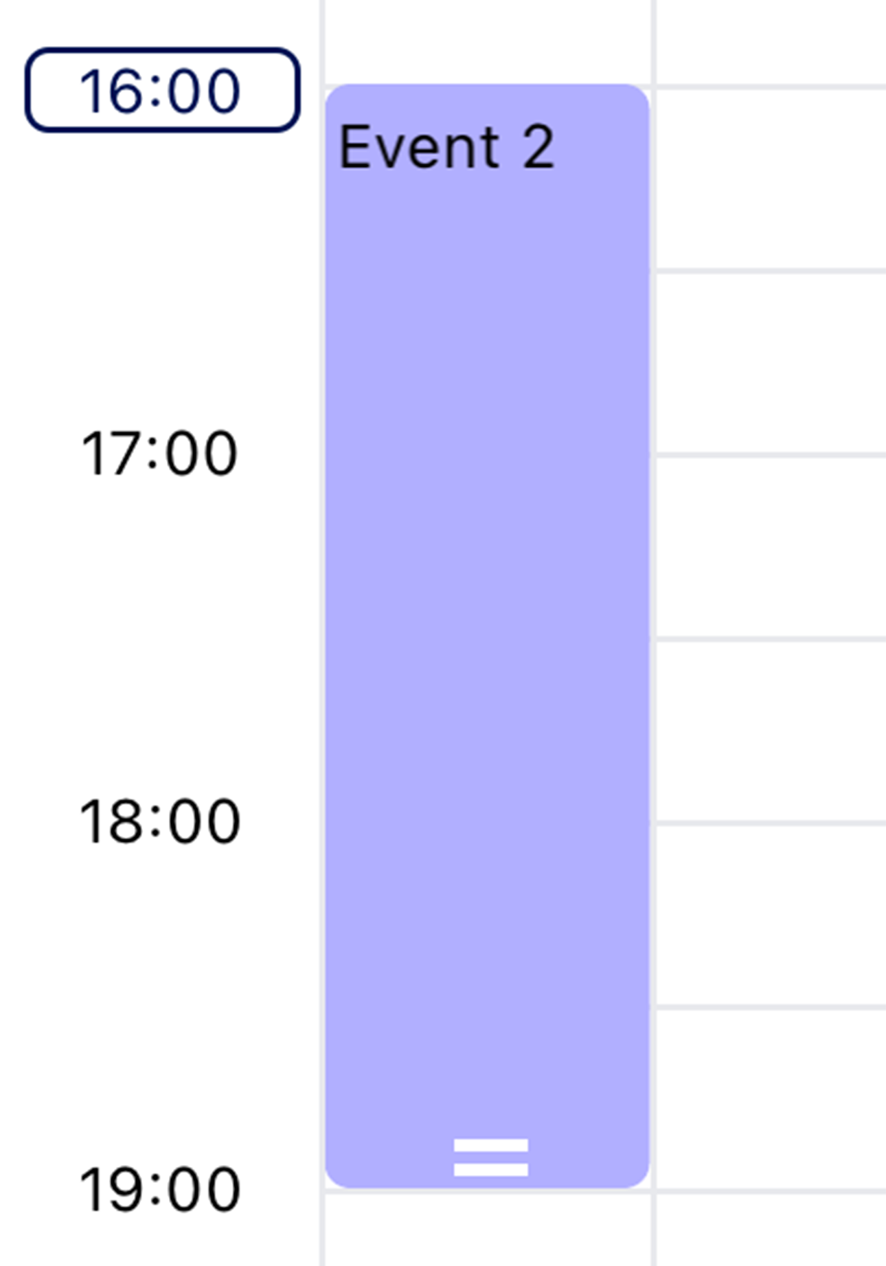
-
editIndicatorColor -
dragHourContainer -
dragHourText
EditIndicatorComponent
Custom edit indicator
